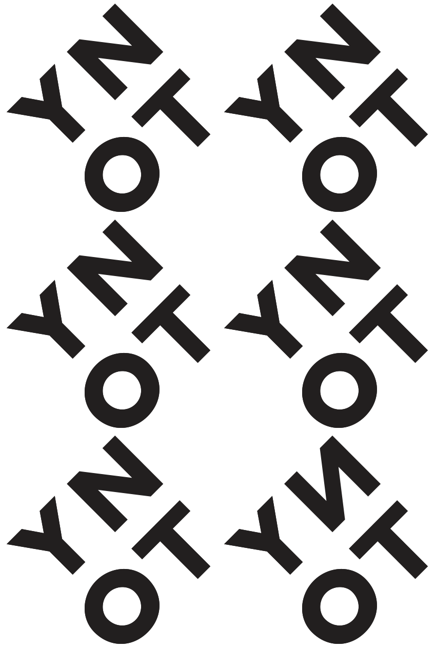
I made a logo which I have now attached meaning to as personal work. Below is a bit of the process I went through to get there. I am not saying it’s the best logo in the world or that I have even made for that matter. But it’s helpful to see the thinking pattern. Being aware of what works and what doesn’t.
I probably should have seen the genital shape made by the confluence of lines here. But I was convincing myself about the heart idea which was overriding my ability to step back and look.
Not every single little step can be shown here. But even starting close to where you want to finish takes refinement of a lot of components. Some of the better marks I have make have taken months of work. You can see some of the more successful outputs in Type+Logos here.


